Sunday, October 28, 2018

Statement of Intent

Below is my statement of intent this is what I intent to do for my website, linked page and both magazine covers and content pages.

I intend to make a magazine front cover and a single sheet content page spread for both editions. For my first edition, I would like to make a cover for the autumn season using the theme of nature. In edition one, I want to portray chic and trendy fashion; which reach and address my target audience. The model will be wearing minimal makeup to coincide with the theme of nature. I also intent to take the photos for my front cover as a close up and for my content page I want to take a medium shot with both a lower and higher angle. I want to use the natural lighting afternoon light.  This edition will be about adventure and nature, sending the message of happiness and wanderlust. For my second edition, I would like to make a cover for the winter season with the theme of New Years and New Beginnings. I intend to present an alternative way of spending new years: staying at home. The models will be wearing winter clothing such as coats, jumpers or turtlenecks. I would like these to have a maximum of 3 to 4 features so it can focus on the model. The features in this edition will be about starting fresh and having fun, I want this to send the message of new beginnings. I would also like to take photos against different muted backgrounds to have colours connoted with winter. I will use the convention of placement of text and the size/font used in both the front covers. I will be portraying different social groups by having models of different ethnicity in the front covers and content page, and I will portray different issue, events and people through different features.

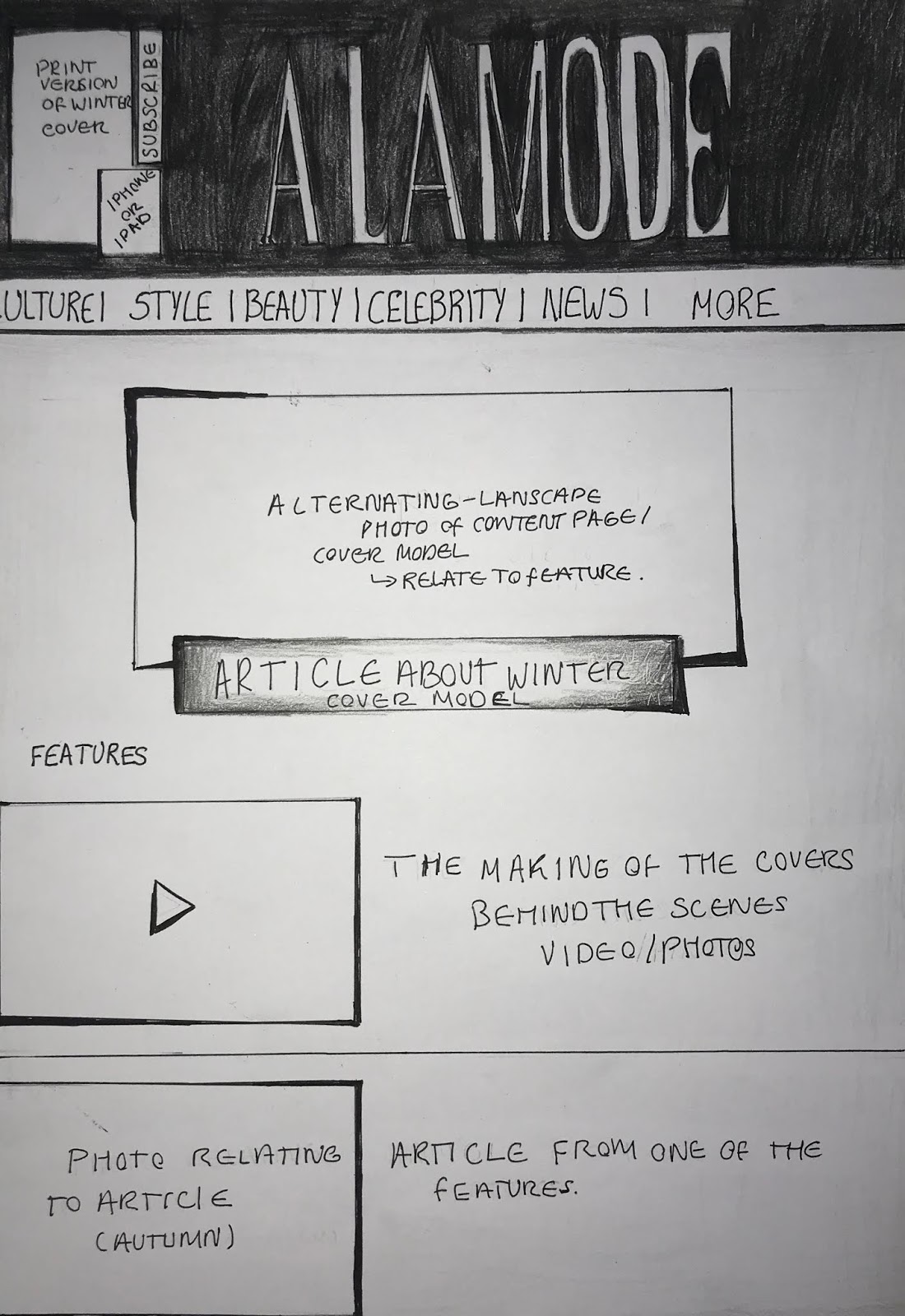
I intend to make both a home page and a linked page for my website. For my homepage, I intend to use features from both front covers, and images that were also used in my content pages. Similarly to existing fashion magazine websites, I want to have the features which stand out the most is the ones of the front cover models. Adding to this, I want my linked page to be an article of the front cover model from the first edition and be the first article on the website, on this article I want to have an audio/visual which I intend to make as an interview with the model. I intent to feature 3 articles from my content pages from various areas of a fashion magazine such as: fashion, beauty and travel.


The digitally convergent nature of my media products will be shown through my house style. This means that both the front covers, content pages and the website will feature the same masthead, typography and images which feature the same models. For continuity I will feature links to social media on both content pages and my linked page. I think that consumers will respond and interpret positively to my product as I have drawn inspiration from many already successful fashion magazines. Consumers will become producers themselves through the references to social media and encouragement throughout the product for them to communicate to the magazine.

Reader Profile

Below is the profile of the Á La Mode reader and the way that the information is presented to coincide with the reader:


The Á La Mode ideal reader will be going to university and is around the age of 20 from an AB demograophic, enjoys shopping, jet setting and always looking her best, she comes to the magazine for a curated selection of news in different areas, she is still discovering her style but is always confident about what she wears. She is seen often taking photos to post on her social media, she enjoys being ahead of the trends but hates waking up early. She spends her time going to concert to see her favourite musician, enjoys to occasionally watch a new series on Netflix and discovering new places across London. She likes reading magazines which have a new perspective on a well-known stories and talks about both sides allowing her to chose what she believes.


Saturday, October 27, 2018

Flat Planning my Website and Linked Page

I have made a flat plan for my website homepage and the linked page which will be beauty:

THE HOMEPAGE FLAT PLAN:


I have made the flat plan for my homepage, I have chosen to have a black strap across the masthead as this is how the Grazia website has it, and they are also managed by Bauer. I have added three posts which will be the articles from both front cover. I will include an ad when scrolling down in the home page, as well as continuity with the front cover by using images of the same models as the ones on the magazine. I am going to include links to social media at the menu tab more and at the bottom of the page. I am creating continuity between the print version and the digital version by adding the latest edition of my magazine at the right hand top corner and a subscribe option, similarly to the Tatler website. People will want to visit this website because it is simple and minimalistic while still having the characteristics of a fashion magazine website.


THE LINKED PAGE FLAT PLAN:

I have chosen to make my linked page about beauty because it is one which is overlooked when looking at fashion magazines, despite not using much makeup in my front covers I want the beauty page to not just be about makeup but also hair and nails, I have designed the flat plan to look as if the last post is cut off to show that there is more when scrolling down. Here I have planned to have five posts, which relate to different aspects of beauty. I am planning on using the articles from my front cover and content page to post on this page, using the same or very similar images on this linked page to create continuity and establish a relationship between the print and digital version. This linked page has been inspired by Harper's Bazaar with the large image as soon as the page is opened, I want this to be a photo of a woman laughing to set a positive vibe for this page, as this is what people want to feel when reading a magazine.

Flat Planning for the Front Covers and Content Pages


I have made a flat plan for both the front cover and content page for the autumn edition below:

FLAT PLAN FRONT COVER (AUTUMN):

I have used a brown and yellow colour scheme for this flat plan, to represent the colour of leaves during this time of the year. As I have planed to take this photo in the part I have added the feature with 'Autumn Adventure', adventure is commonly associated with the outdoors. I have made the masthead orange to match the clothing and background. I have used only four other features, these features relate to the autumn theme but I think that they could be improved to relate to the theme of nature more. I could also improve the positioning of the date of the issue, and make text of varying sizes of texts to make it stand out more. I have tried to follow the covers of Harper's Bazaar, such as the, placement of the text and the closeup photo. Here I have used the theme of nature and tried to portray this through the articles and colour scheme.

INSPIRATION FOR MAGAZINE FRONT COVER AND CONTENT PAGE:


I have sourced my front cover from Harper's Bazaar, while for the content page I have sourced Grazia and their use of shapes and lone items around the main image.


FLAT PLAN CONTENT PAGE (AUTUMN):    

I have made used a similar colour scheme as the front cover, to have splashes of colour such as orange and yellow to create continuity throughout the magazine. I have added the areas that I will be exploring such as beauty and news, here I have said style instead of fashion but this may be subject to change onto fashion. As the house style all of the text will be places in the same order and the masthead and content will be black with a white background.  I am going to use the same font as the masthead fro the subheadings and the 'content' title and numbers. To have continuity with the theme of nature I am going to use a photo of another model in a similar setting and an alternative photo of the front cover model in the circle.


FLAT PLAN FOR FRONT COVER (WINTER):

 I have created used a blue colour scheme for the background and the clothes, I have also similarly to the autumn edition done the masthead the same colour as the clothing, the theme for this edition is the New Year, I have tried to portray this in the use of articles with the New Year; also similarly with the autumn edition flat plan, I need to make the size and typeface of the text change and make them more varied in sizes. I have tried creating a house style with the mentioning of the season and use of alliteration in both editions and the way that the features are laid out, such as fashion on the bottom left and the feature about London on the bottom right. The different theme changed the background that I have used but the font and placement of the text should be similar, I have also used a close up for both covers.


FLAT PLAN FOR CONTENT PAGE (WINTER):

I have tried to have a house style for the content page as well, I want to have a beauty item in both content pages such as in this content page where its nail polish the other content page it will be lipgloss, I have also changed the placement of the photos but tried to have the house style with the placement of the text and the circle imagery. In this cover I also plan to make the subheadings and numbers as the same font as the masthead. I am going to have continuity between this content page and the front cover through colour and the articles that are being featured.

Tuesday, October 23, 2018

Location Research

For my locations I have chosen to take my photos in a studio and a park, the park will be for my autumn cover which I want to portray nature and trendy/chic fashion, while for the winter edition I am going to shoot it in the studio so I can have a controlled environment and allows me to experiment more with lights and colours, which I want to portray a minimalistic/comfort fashion style. As a result I have only done location research for the park.

THE LOCATION SHOTS:


In these photos I have only taken long shots of the landscape to show where I will specifically be taking the photos. I have chosen this park as its trees make it have a unique atmosphere, and when it is more sunny the trees give the photo a dappled effect with the light, which I think gives a photo a distinctive quality.

Website Design

I have created two mouldboards one for each of the websites that I have visited, this will give me a visual for each of the aspects of a fashion magazine website and plan mine accordingly. Below are two mood boards for Harper's Bazaar and Tatler.

HARPER'S BAZAAR:


I have researched four of their different social media being: Instagram, Facebook, Twitter and Youtube. I have added the latest front cover at the centre of the mood board to show the continuity that they have throughout their digital brands. They have various stories and interviews on their youtube accounts, and post constantly about their articles on their other social media, on their website they also post the latest news in Pop and celebrity culture. They use their latest front cover and front cover model as often as possible, which makes their online brand more cohesive with their paper brand.

TATLER:


I have again researched four of their different social media being: Instagram, Facebook, Twitter and Youtube. I have added the latest front cover at the centre of the mood board to show the continuity that they have throughout their digital brands. Unlike Harper's Bazaar they don't post regularly on their Youtube account or have many stories. They also post alternative photos for their articles on Instagram, many vintage photos, they also don't use the latest front cover as their profile photos on their social media, they instead use their masthead, which limits their continuity and cohesion but makes their brand clear.

For my own magazine website I want to have a simple colour scheme like both of these magazines, which is often black and white and grey, and I want to use an alternative landscape photo of the cover model or content page model as the feature for the latest front cover which I make. Additionally, I want to have a block design for the features, with a menu bar across the top of the homepage.

Fashion Magazine Website Investigation

I have looked at the Tattler and Harper's Bazaar websites and made a presentation, in this presentation I have included screenshots of each area I am discussing and I have also added some of my ideas for my own magazine's website.

FASHION MAGAZINE WEBSITE INVESTIGATION AND ANALYSIS:

Design by Be C

Monday, October 22, 2018

Choosing the Masthead

I have looked at fonts online, and narrowed mine down to five different fonts, to choose a final one i have once again done a survey, to see what an 16-25 year-old would prefer the masthead for a fashion magazine cover named 'A LA MODE'. I have chose mostly serif fonts as I think that these are traditionally used the most in fashion magazines and is connoted as classic and elegant which is what I want my magazine to be. I have also added a couple of fonts which aren't in capitals this is to add variation, these fonts are also more calligraphic, as I also wanted to see how the audience would respond to a masthead which isn't commonly used in fashion magazines.

THE SURVEY:


MY CONCLUSIONS:

I have chosen the second masthead, the font used is called Edition, this is similar to Elle fashion magazine masthead, it is a serif of which is considered elegant and classic, but this one also has some elements of modern fonts. I want this to be bold so I have made almost all the mastheads in capitals, this is also what most fashion magazines that I am inspired have their mastheads.

Planning the Front Covers, Content Pages and Websites

Below is a presentation of a website plan I made which I have made on Wix, in this presentation I have used a template to plan a website which I could possible make and to see what it looks like, I have also made two mind maps for each of my plan for my first two editions.

WEBSITE DESIGN PLAN:


PLAN FOR EDITION 1:


PLAN FOR EDITION 2:

Friday, October 19, 2018

Colours Scheme, Feature and Typography Research

For this research I am going to look into the different aspects separately but only looking into covers of Elle, Vogue and Harper's Bazaar, for all of these. For the colour scheme research I am going to look at the colour wheel and its relation to colour and the way different colours have different connotations, and then analyse how this used in four different seasonal covers of Elle, Vogue and Harper's Bazaar, while also analysing the reasoning behind the typographic choices, which I have done research for by looking at the connotations of the three types of typefaces. I have also used the colour scheme and the typography to analyse their motivations behind the features.


Speak Visually. Create a presentation with Visme

For my own magazine covers I want to use the seasons of autumn and winter, for the features I want to have the name of the season and an alliteration which is often used by magazines in some more special issues. For my autumn edition I want to use a colour scheme of greens and oranges with black and white for text, I think that this colour scheme blends well with the background and will make it stand out. While for the winter edition I want to use cooler hues with different shades of white and blues, these are colours which represent winter at their best as winter is cold and often associated with snow. For my masthead I want to use a serif font and want it to be in capitals, this will make it seem classic and elegant and will match the French name. I want to use the same font as the masthead for the main feature and a similar font for the other articles.

Sunday, October 7, 2018

Choosing a Name

In this project I have three different main ideas for magazine names, for my final choice I have chosen to do a survey mostly within the age group of the magazine (16-25), the blank survey I have made is below...

BLANK SURVEY:


MEANING OF THE NAMES:

I have narrowed it down to these three names as I think that they are the most interesting to represent a fashion magazine. Below are three brief dictionary descriptions of what each of these words mean:

  • MANIA - An obsession, an excessive enthusiasm or desire.
  • CRAZE - A euphemism for an object or activity which achieves widespread popularity but this popularity is short lived. 
  • Á LA MODE - In fashion, up to date.
  • CHIC - Stylish and elegantly fashionable.

COMPLETED SURVEY:


CONCLUSIONS:

For the survey I asked the seven people to add their initials above and then choose one or two names that they thought would be best for a fashion magazine, I also asked them to write any notes/thoughts they had about these names on the side. From the survey I have chosen the most popular name: Á La Mode. This name means in fashion and up to date, which reflects what I would like my magazine to be like, in French which I think is fitting of a fashion magazine, as Paris is one of the four fashion capitals of the world and is home to some of the worlds most famous brands. Paris is also where someone who is in my target demographic may visit often or shop often, my target demographic may also go travel much and go to private schools which means that they most likely speak another language French being one of them.

Friday, October 5, 2018

Celebrity/Model Representation In Fashion Magazines

As fashion magazine commonly features a famous celebrity or model, I am looking into different model or celebrity representations in fashion magazines, for this I have looked into three different magazine covers for the actress Jennifer Lawrence; I have focused on Vogue, Elle Canada and Vanity Fair, I have analysed each of the front covers individually, while talking about the representation of the actress and comparing them throughout.  

THE FASHION FRONT COVERS:


Thursday, October 4, 2018

Fashion Photography Investigation

I have made a presentation which explores both fashion photography and fashion magazine photography. In this presentation I have researched the different aspects of fashion photography, the different ways that they can be achieved and the effect they have on the photos. For the fashion magazine photography investigation, I have chosen three front covers and stated how the aspects of fashion photography have been used and evaluated the effectiveness of this, in relation to the season of the article. This will help me, as I can learn more about the photos used in fashion magazine's and the types of photos i should be aiming to have as well as it helps me gain ideas of what I will want to do for my own magazine.

FASHION PHOTOGRAPHY AND FASHION MAGAZINE PHOTOGRAPHY RESEARCH:


FASHION PHOTOGRAPHY INVESTIGATION by Be C

About the Bauer Media Group

I have made a Pow toon presentation which investigates the Bauer Media Group and their importance in media and how this helps me in my work.

INVESTIGATION OF THE BAUER MEDIA GROUP:

Wednesday, October 3, 2018

Case Studies

For these case studies, I have chosen the fashion magazine Red and Vogue UK, I have chosen to look in depth at Vogue UK and only deconstructing an issue of Red's front cover and content pages. I have done this because it will be important as it will be the magazine which I take the most inspiration for my own and will help me understand the readership of an actual fashion magazine.

THE CASE STUDY OF VOUGE:

Powered by emaze

DECONSTRUCTION OF RED MAGAZINE FRONT COVER AND CONTENT PAGE:


Fashion Moodboard


For my overall fashion magazine aesthetic I have made a fashion mood board, which will help me know what I can do and help me develop my ideas, the mood board which I made uses fashion photography, magazine covers, different fonts, and colour palettes;  I have not included any images of websites as I wanted to make this more focused on the brand of the magazine. I have chosen to focus on theme of winter and autumn, and have chosen what will be included in this mood board accordingly...

MOOD BOARD:


In this mood board I have chosen photography which has been taken in a range of places with many different models, and mis-en-scene, these are useful as they all look as if from the seasons which I want to use for my own magazine, I have chosen these specific photos as I want to draw inspiration from many different types of photos, angles, lighting and setting. For the fonts I have chosen four different types of font which are both serif and sans serif, I have chosen these because these are very minimalism but stylish, they are the modern types of fonts that would now be used in a fashion magazine. I have few magazine covers as I wanted to broaden the types of styles that I could look into and the colour palettes, I have chosen the ones which I found the most seasonal, although I may not use these colour palettes on my own magazine; I would like to make something which takes elements from these, such as some of the colder blue hues for winter and the warmer orange ones for autumn. Overall I think that what worked well in this mood board is the variety of different elements which I have included, but I think that I could have added more magazine covers as this is what the main focus of my brief is and also added print screens from websites, despite wanting to focus on the branding.

Looking back, the mood board above does not match the themes which I am looking for. I have used two images which look out of place, the Cara Delevingne Vogue cover which uses brighter colours despite the splashes of blue, and this does not go with the muted colours and the autumn theme which I have used on that side of the page, does not fit the overall mood either. I have made two other mood boards, one for each season: autumn and winter, below...

AUTUMN MOOD BOARD:


In the autumn edition, I would like to use the theme of nature and everything being more natural. Here I have chosen some magazine covers which use the orange and green colour palette as this is what I'm aiming to do. I also would like to experiment with the blurry background and lighting; I would also like to take photos which use trendy and chic clothing instead of avant-garde garments, as it is clothing that women wear everyday and make it more relatable, similarly to the Gigi Hadid Vogue cover. As shown by the majority of photos I would also like to take photos in a park and near trees, as this is the epitome of nature and it follows the similar colour scheme to what I want. The images of websites that are here are some potential liked pages and website home pages structure that I could use, they also feature articles from their autumn edition which is what I would like to include despite the winter edition being the last one, thus being used the most on the website.

WINTER MOOD BOARD:


In this winter edition, I want to use a theme of comfort, minimalism and New Years, I have chosen photos with muted colours or cooler hues, with the poses the models are making it seem more genuine and this is what I am aiming to do, the clothes that the models are wearing are comfortable and chic but not extravagant which is how I want to make my cover, as I want to make the magazine have it's own style of portraying fashion. I want to take these photos in a city street or a studio, where I can control the lighting and the background colour, but I also want to take some photos on a street to make it more spontaneous. 

Monday, October 1, 2018

My Target Audience

In this post I will be researching my target audience for the magazine to allow me to carefully plan who to reach the ideal reader of this fashion magazine. 

The brief tells me that I will be making a magazine for a target audience of 16-25 women from AB class background. The UK, the class system is measured using the NSR Social Grid, here is a copy below, indicating the class system I should be looking into.

THE NSR SOCIAL GRID:


INFORMATION ABOUT THE POTENTIAL LIVES OF THE AB CLASS:

  • Jobs: company owner's, CEO's, barrister's, surgeon's, financiers 
  • Income: enough for private education, luxury cars and homes 
  • Spare time: shopping, afternoon tea, traveling 
  • Political Stance: Conservative
  • Food shopping: Waitrose, Fortum and Masons, Harrods Food Hall
  • Clothes: designer clothing, Harrods, Selfridges
  • Live in: Victoria, Knightsbridge (somewhere very green, secure and in central London)
  • Education: private schools, well-educated, speak well 
SOME CHARACTERISTIC'S OF A MODEL AB PERSON:
  • In the 16-25 female demographic
  • Wears designer clothes, shoes and makeup
  • Active social media user
  • Private education
  • Inheritance 
  • Enjoys jet setting and partying  
  • Likes to keep up to date with fashion and world news 

The Importance of Continuity

In this post i want to explore the meaning of continuity and it's importance on a magazine's front cover and content page, this is a key part of what a magazine needs to allow readers know that this is their style, it will make it look more cohesive and create a house style, which is what makes the magazine easily identifiable.

THE IMPORTANCE OF CONTINUITY:


Deconstructions of Fashion Magazine Websites

To begin the research for my magazines website i have deconstructed three different home web pages of these magazine websites; I have looked Vogue's website and linked pages and analysed them.

VOGUE WEBSITE DECONSTRUCTION:

CONCLUSIONS:

What worked with looking into this website is that this is a famous magazine and website and they know what they are doing so this helps me know what elements they use and what should be used, from this website i can already see that mine should have a white/light natural coloured background, one main landscape image with the most important article and the others should be below with the latest news, for the linked page there should be one topic and will also usually include block ads from fashion houses. The Vogue website is a simple one which is easy to navigate and lets the readers know what they need too, this in turn attract readers through it's aesthetic.


Deconstruction of Magazine Covers and Content Pages

For me to get a further understanding of magazine front covers and content pages, their conventions and different house styles, I have deconstructed some of the front covers and content pages of fashion magazines from the month of September and October. In these magazine deconstructions I have compared the magazine covers and content pages, which can help me understand what I should include on my own, I also looked into the colour palettes of these magazines and the reasoning behind this, which will help me develop a an appropriate colour palette, as well as analysing the reasoning behind the language that they made for the magazine.

Below is a Power Point to present the aforementioned information and research

Project and Brief


Related image

For the following project that I will be documenting in this blog the brief set is to make two front covers, two content pages and a working website for a new fashion magazine being launched by the Bauer Media Group, in this post I will be outlining what a brief is and some of the key information given to me in the brief, but first...

WHAT A BRIEF IS:

A brief is a document which defines what the outcome that a client wants from a project to the designer, in the dictionary this is defined as "a set of instructions given to a person about a job or task"

OUTLINE OF MY BRIEF:

  • The main objective is to produce two consecutive front covers and content pages for a new fashion magazine and a working website with one linked page
  • The content page must include at least four main images 

  • There must use a different setting for each magazine cover 
  • The web page must promote a new magazine to it's target audience and must make fans want to interact with the content
  • This fashion magazine is being launched by the Bauer Media Group who intend to sell it at retailers
    Image result for gif fashion magazine
  • The front cover and content page must feature a diverse range of fashion issues and and style appropriate to the target audience of 16 to 25 year old women from the AB class

WHAT I THINK:

I think that this project isn't brand new for me, as I have worked on a music magazine for my preliminary, but there will be new aspects of it such as the working website and the linked page which I have not done before. This being a fashion and not music magazine will also allow me to explore different ways of making a magazine cover as each genre of magazines have a different set of conventions and styles, which I think will be interesting to explore and develop my own similar style and convention.

Closed Blog Notification

Centre: NMBEC Centre No: 14343 Candidate Name: Beatriz Rodrigues Coelho Candidate No: 3181