Centre: NMBEC
Centre No: 14343
Candidate Name: Beatriz Rodrigues Coelho
Candidate No: 3181
Friday, March 8, 2019
Saturday, December 15, 2018
Update: Week of 09/12/18
UPDATE:
During this week I have now gone back to edit the homepage, the main changes was the main two articles which I tried to make them more similar to Vogue, because I did not like the aesthetic of the article previously. Another change is the placement of the images on the right, most Bauer magazines website have the images on the right and the addition of a block ad, for the conventions. I have also gone back to change the video, because of copyright concerns I changed the music and cut out some small unnecessary parts of the video, in regards to my linked page I have now added the video and it is complete.
Saturday, December 8, 2018
Update: Week of 02/12/18
UPDATE:
During this week I am making my linked page, I decided
to change this from a beauty page to an article about the front cover model,
this will allow me to have my audio/visual which is an interview realistically
integrated on the website. This will also create cohesion between the website
and edition one. This has not been as challenging as the home page, and I am
happy with the results of the linked page. The most difficult part of this was
writing the article as I had to make it in accordance to the interview.
Saturday, December 1, 2018
Update: Week of 25/11/18
UPDATE:
During this week I am began making my website, I made
the homepage for now, I am happy with the results of the homepage, but hope to
improve it to make it look more like other fashion magazine websites. So far,
it was difficult learning how to use the program in the beginning but I learned
eventually and began making the website, the biggest challenge I encountered is
the header, I wanted to initially make it like my flat plan but to make it work
better, I had to make it thinner, this also worked out well in the end as now
it looks similar to the Grazia header. My main
inspiration for this homepage was Harper's Bazaar and Elle.
Saturday, November 24, 2018
Update: Week of 18/11/18
UPDATE:
During this week I am beginning to edit my video. I have
chosen to do an interview with the autumn cover model, this will also be an
article and become my linked page. So far I have found editing pretty good, I
have an idea of what I want the video to look like in the end and I am worked
towards that. I have had some issue with finding the right music but I am
focusing on the video which was too long and had to be shortened down. Overall
I am happy with the results of the video and I can add the finishing touches
after I've completed my website.
Tuesday, November 20, 2018
Interim Review Notes
The Interim Review Notes:
Edition One:
Cover:
Move 'natural' further away from the eyes
Content Page:
Fix the Grammatical Errors
Edition Two:
Cover:
Change the colour of the masthead so it stands out against the background
Change from the feature "most snowy" to snowiest
Content Page:
Fix the Grammatical Errors
Edition One:
Cover:
Move 'natural' further away from the eyes
Content Page:
Fix the Grammatical Errors
Edition Two:
Cover:
Change the colour of the masthead so it stands out against the background
Change from the feature "most snowy" to snowiest
Content Page:
Fix the Grammatical Errors
Sunday, October 28, 2018
Statement of Intent
Below is my statement of intent this is what I intent to do for my website, linked page and both magazine covers and content pages.
I intend to make a magazine front cover and a single sheet
content page spread for both editions. For my first edition, I would like to
make a cover for the autumn season using the theme of nature. In edition one, I
want to portray chic and trendy fashion; which reach and address my target
audience. The model will be wearing minimal makeup to coincide with the theme
of nature. I also intent to take the photos for my front cover as a close up
and for my content page I want to take a medium shot with both a lower and
higher angle. I want to use the natural lighting afternoon light. This edition will be about adventure and
nature, sending the message of happiness and wanderlust. For my second edition,
I would like to make a cover for the winter season with the theme of New Years
and New Beginnings. I intend to present an alternative way of spending new
years: staying at home. The models will be wearing winter clothing such as
coats, jumpers or turtlenecks. I would like these to have a maximum of 3 to 4
features so it can focus on the model. The features in this edition will be
about starting fresh and having fun, I want this to send the message of new
beginnings. I would also like to take photos against different muted backgrounds
to have colours connoted with winter. I will use the convention of placement of
text and the size/font used in both the front covers. I will be portraying different
social groups by having models of different ethnicity in the front covers and
content page, and I will portray different issue, events and people through
different features.
I intend to make both a home page and a linked page for my
website. For my homepage, I intend to use features from both front covers, and
images that were also used in my content pages. Similarly to existing fashion
magazine websites, I want to have the features which stand out the most is the
ones of the front cover models. Adding to this, I want my linked page to be an
article of the front cover model from the first edition and be the first
article on the website, on this article I want to have an audio/visual which I
intend to make as an interview with the model. I intent to feature 3 articles
from my content pages from various areas of a fashion magazine such as:
fashion, beauty and travel.
The digitally convergent nature of my media products will be
shown through my house style. This means that both the front covers, content
pages and the website will feature the same masthead, typography and images
which feature the same models. For continuity I will feature links to social
media on both content pages and my linked page. I think that consumers will
respond and interpret positively to my product as I have drawn inspiration from
many already successful fashion magazines. Consumers will become producers
themselves through the references to social media and encouragement throughout
the product for them to communicate to the magazine.
Reader Profile
Below is the profile of the Á La Mode reader and the way that the information is presented to coincide with the reader:


The Á La Mode ideal reader will be going to university and is around the age of 20 from an AB demograophic, enjoys shopping, jet setting and always looking her best, she comes to the magazine for a curated selection of news in different areas, she is still discovering her style but is always confident about what she wears. She is seen often taking photos to post on her social media, she enjoys being ahead of the trends but hates waking up early. She spends her time going to concert to see her favourite musician, enjoys to occasionally watch a new series on Netflix and discovering new places across London. She likes reading magazines which have a new perspective on a well-known stories and talks about both sides allowing her to chose what she believes.
Saturday, October 27, 2018
Flat Planning my Website and Linked Page
I have made a flat plan for my website homepage and the linked page which will be beauty:
THE HOMEPAGE FLAT PLAN:

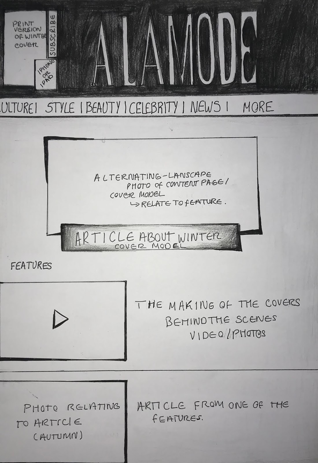
I have made the flat plan for my homepage, I have chosen to have a black strap across the masthead as this is how the Grazia website has it, and they are also managed by Bauer. I have added three posts which will be the articles from both front cover. I will include an ad when scrolling down in the home page, as well as continuity with the front cover by using images of the same models as the ones on the magazine. I am going to include links to social media at the menu tab more and at the bottom of the page. I am creating continuity between the print version and the digital version by adding the latest edition of my magazine at the right hand top corner and a subscribe option, similarly to the Tatler website. People will want to visit this website because it is simple and minimalistic while still having the characteristics of a fashion magazine website.
THE LINKED PAGE FLAT PLAN:
 I have chosen to make my linked page about beauty because it is one which is overlooked when looking at fashion magazines, despite not using much makeup in my front covers I want the beauty page to not just be about makeup but also hair and nails, I have designed the flat plan to look as if the last post is cut off to show that there is more when scrolling down. Here I have planned to have five posts, which relate to different aspects of beauty. I am planning on using the articles from my front cover and content page to post on this page, using the same or very similar images on this linked page to create continuity and establish a relationship between the print and digital version. This linked page has been inspired by Harper's Bazaar with the large image as soon as the page is opened, I want this to be a photo of a woman laughing to set a positive vibe for this page, as this is what people want to feel when reading a magazine.
THE HOMEPAGE FLAT PLAN:
I have made the flat plan for my homepage, I have chosen to have a black strap across the masthead as this is how the Grazia website has it, and they are also managed by Bauer. I have added three posts which will be the articles from both front cover. I will include an ad when scrolling down in the home page, as well as continuity with the front cover by using images of the same models as the ones on the magazine. I am going to include links to social media at the menu tab more and at the bottom of the page. I am creating continuity between the print version and the digital version by adding the latest edition of my magazine at the right hand top corner and a subscribe option, similarly to the Tatler website. People will want to visit this website because it is simple and minimalistic while still having the characteristics of a fashion magazine website.
THE LINKED PAGE FLAT PLAN:

Flat Planning for the Front Covers and Content Pages
I have made a flat plan for both the front cover and content page for the autumn edition below:
FLAT PLAN FRONT COVER (AUTUMN):

I have used a brown and yellow colour scheme for this flat plan, to represent the colour of leaves during this time of the year. As I have planed to take this photo in the part I have added the feature with 'Autumn Adventure', adventure is commonly associated with the outdoors. I have made the masthead orange to match the clothing and background. I have used only four other features, these features relate to the autumn theme but I think that they could be improved to relate to the theme of nature more. I could also improve the positioning of the date of the issue, and make text of varying sizes of texts to make it stand out more. I have tried to follow the covers of Harper's Bazaar, such as the, placement of the text and the closeup photo. Here I have used the theme of nature and tried to portray this through the articles and colour scheme.
INSPIRATION FOR MAGAZINE FRONT COVER AND CONTENT PAGE:


I have sourced my front cover from Harper's Bazaar, while for the content page I have sourced Grazia and their use of shapes and lone items around the main image.
FLAT PLAN CONTENT PAGE (AUTUMN):

FLAT PLAN FOR FRONT COVER (WINTER):

FLAT PLAN FOR CONTENT PAGE (WINTER):

Tuesday, October 23, 2018
Location Research
For my locations I have chosen to take my photos in a studio and a park, the park will be for my autumn cover which I want to portray nature and trendy/chic fashion, while for the winter edition I am going to shoot it in the studio so I can have a controlled environment and allows me to experiment more with lights and colours, which I want to portray a minimalistic/comfort fashion style. As a result I have only done location research for the park.


In these photos I have only taken long shots of the landscape to show where I will specifically be taking the photos. I have chosen this park as its trees make it have a unique atmosphere, and when it is more sunny the trees give the photo a dappled effect with the light, which I think gives a photo a distinctive quality.
THE LOCATION SHOTS:


In these photos I have only taken long shots of the landscape to show where I will specifically be taking the photos. I have chosen this park as its trees make it have a unique atmosphere, and when it is more sunny the trees give the photo a dappled effect with the light, which I think gives a photo a distinctive quality.
Subscribe to:
Posts (Atom)
-
For the following project that I will be documenting in this blog the brief set is to make two front covers, two content pages and a...
-
UPDATE: During this week I am making my linked page, I decided to change this from a beauty page to an article about the front cove...
